You might be thinking that stickers are so childish. Teenagers like to decorate their phones, bags and god knows what else with stickers. How can you use stickers for your marketing efforts, right?
Well, it’s time that you face the reality. The teenagers who used to stack on stickers have grown up and become your potential target. So, if you want to reach your target the right way, stickers can be really helping you. However, you have to know how to design stickers so that you can reap the maximum benefit from them. Let’s get started then.
Why are you designing the stickers for?
Before you get started with the designing process, you have to understand why you are designing the stickers. Will you design the stickers to promote your business? Or will the stickers be a part of your marketing strategy? Where will the stickers appear? Are you going to make huge stickers that can be stuck on walls or other places or will those be small in size that can be stuck behind a mobile phone?
There are numerous questions that you have to answer to make sure that you end up creating a sticker design that is communicative enough. Besides, the number of stickers that you need to print is also something that you need to pay attention to. Once you have sorted out all the details regarding designing and printing stickers for your business, you can proceed to the next step.
Don’t get overwhelmed because I am here to help you out with the process.
Determine the shape:
The design that you would create for your sticker design will depend on the shape and the size of the stickers that you want to design. The shape and size are dependent on why you want to create the stickers.
The most common and cost-effective sticker shape is rectangular. The reason behind why most companies opt for rectangular stickers is that this shape doesn’t need to be cut or processed to fit any custom shape.

However, if you want to create a design that is more customizable or has customized shape, you can do that too. Create a sticker design that has custom design. Get the sticker printed on a rectangular or square shaped cardboard. It will look like the card is shaped as per the shape of your design. Some designs are prepared to paste on transparent surface such as glass doors or windows or mirrors. In this case, the design can even be reversed so that they don’t lose their actual shape.
Even though stickers are generally small and rectangular, sticker designs can be practically of any size. It can be a sentence that you stick on wall. It can also be a collage of pictures that you can stick on the wall. At the same time, you can also choose to create a sticker that is small enough to be stuck on the back of your mobile device.
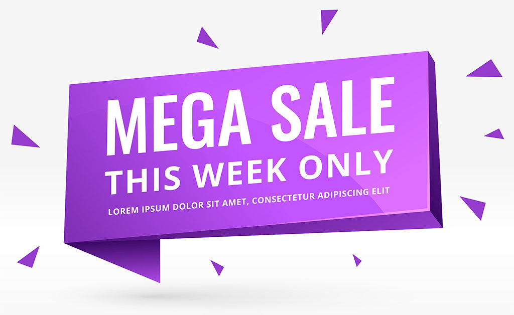
Stickers should be colorful:
Why are you designing stickers in the first place? The simplest answer will be to grab the attention of people. While some of you will create stickers that can be used behind pop-stickers, some of you choose to go big with stickers. No matter what the size of your sticker is, you should make it colorful. The more colorful the sticker design is, the better it will serve the purpose.
Your stickers can be seen from quite a distance if it is colorful and bright. Even if you are planning to create stickers that can be stuck behind laptops, you would like to make sure that the stickers look bright without making the design look gaudy.
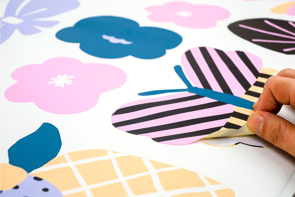
Image courtesy: https://bit.ly/2Yn2rAp
Now, here comes the tricky part. It is too easy to get swept away when using colors to make a design look bright. There are possibilities of using too many colors at the same time. You have to remember that you are asked to create a design that looks bright, not something that looks flashy. So, restrict yourself from using too many colors or colors that don’t complement each other.
Use typography carefully:
The typography that you use for your sticker should be clean and clear. It should be easy to understand even from far away. Give paragraphs a break when you are creating a sticker design. Your sticker should be legible from a distance. Besides, people should be able to read the text in your sticker even if they are on the move.
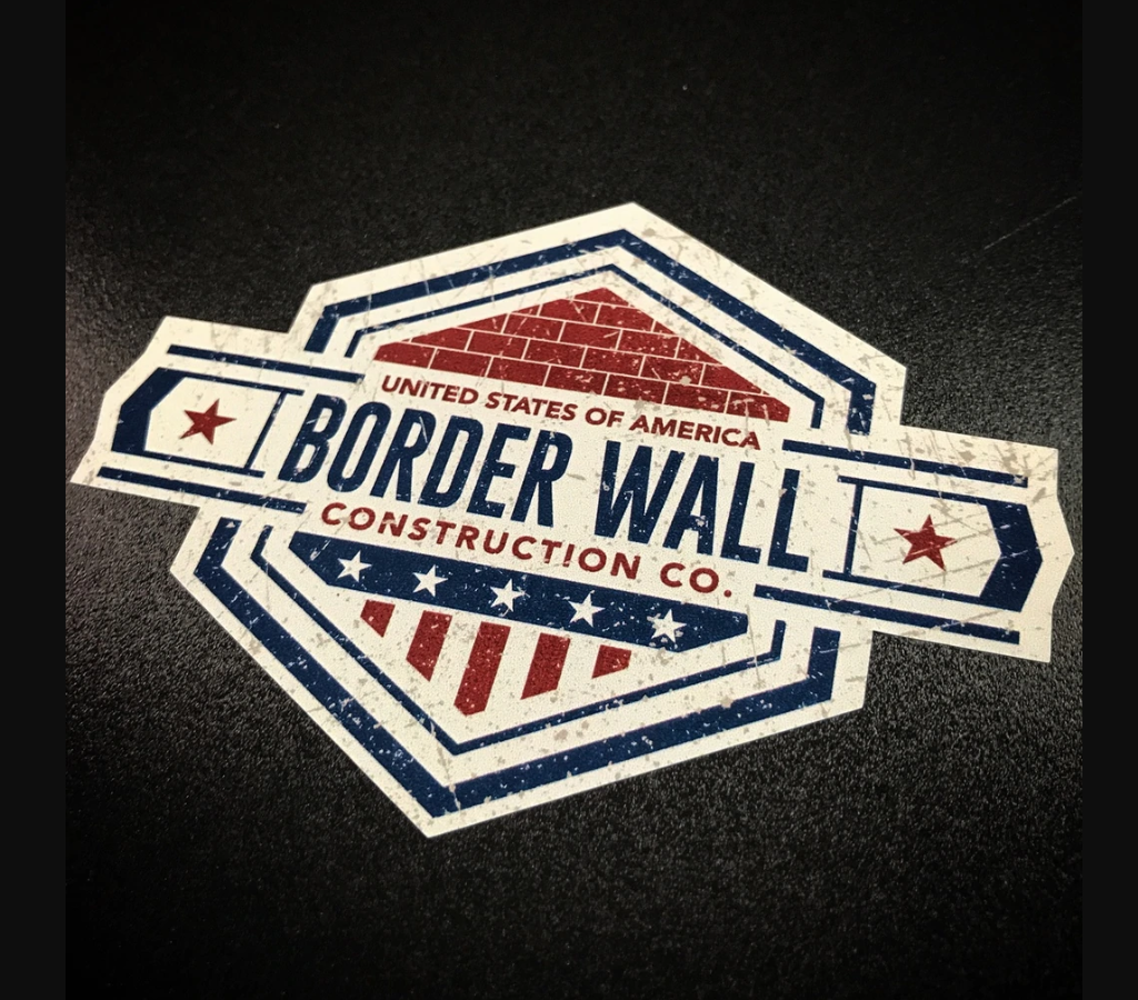
Image courtesy: https://bit.ly/2rlbSEn
A clear typeface is best to convey whatever you want to. You can keep the font bold to ensure even more visibility from far away. There is a simple way that you can implement to ensure that the text is not only visible from a distance but it is also readable. You can use a solid background, preferably a light but bright color. Now you can either use two contrasting colors to place your text or create a shape on the background and place the text along with the shape. Both the methods will help you in creating that contrasting effect to help read the text.
Write less, say more:
The key to attract people is to induce curiosity in them. The less you say the more curious you can make your target audience. Curiosity may have killed the cat but it can save you! Your sticker is not a Wikipedia page where you have to put the history of your company. On the contrary, the design has to be precise and crisp. So, the less you try to say in the sticker, the more you will grab the attention given the fact that the text needs to be to the point.
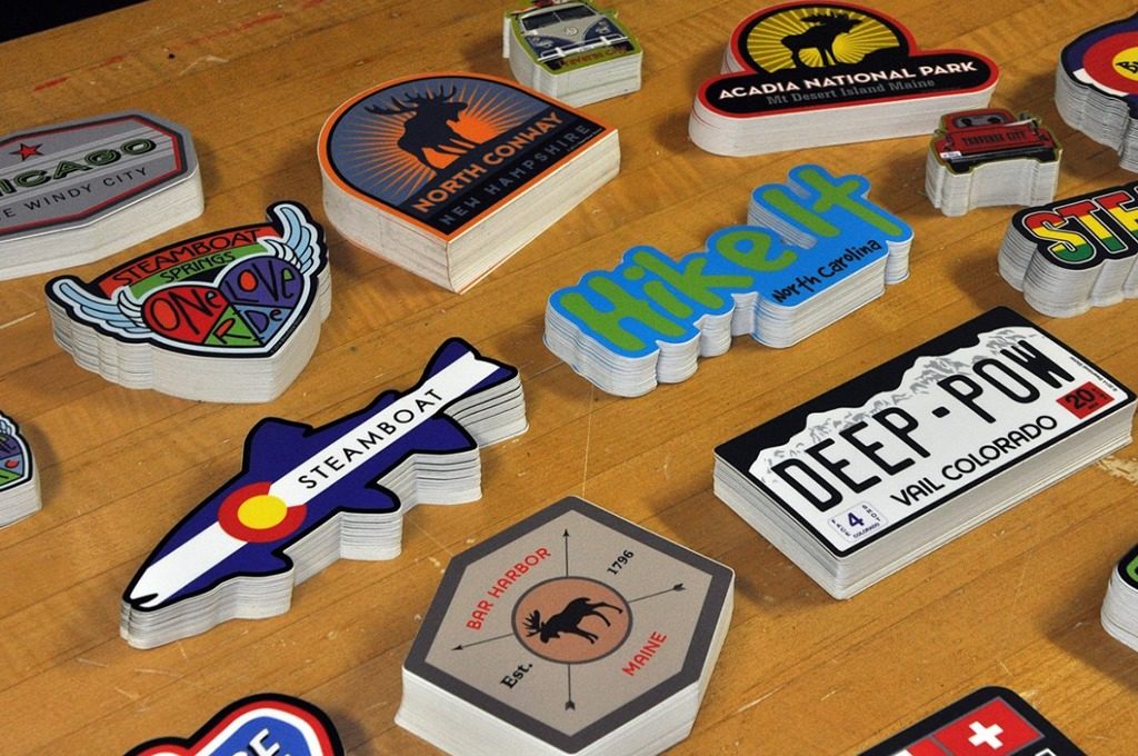
Image courtesy: https://bit.ly/2OUOIOs
You can create a design where you put the name of your company along with the logo. This is the simplest form of design. On the other hand, you can ask a question and let people guess the answer. You can also use icons in case you don’t want to include any text whatsoever. However, you have to keep in mind that the icons or the text that you are using should have an impact on the audience. Check out the image above. You can see how the companies have used the different shapes to create the stickers.
Include your brand:
You should not forget the idea behind creating stickers. Your ultimate aim is to make sure that people recognize your brand. So, no matter what text you include or what typography you use or even the colors that you choose, you should never deviate from your brand identity. Your brand is not only the name of your company or the tagline that you use. Your brand is the typography, the color schemes, the tagline, the name and many other things.
When you are trying to create a sticker that should represent your brand, you should never use typography that contradicts with your brand identity. No matter what colors you choose, don’t use colors that don’t represent your brand. The idea of creating stickers is to increase the span of your brand. If you use anything other than what represents our brand, you are basically not creating any impact.
Let me explain with an example. Suppose you have used a shade of green and blue as your brand color. Now, it’s not ideal for you to use something that doesn’t relate to either of these colors. So, if you use pink or red to create your stickers, it may create conflict with your brand design. Similarly, if you have chosen modern typography for your brand logo design, there is no need to use calligraphy or comic fonts that don’t represent your brand.
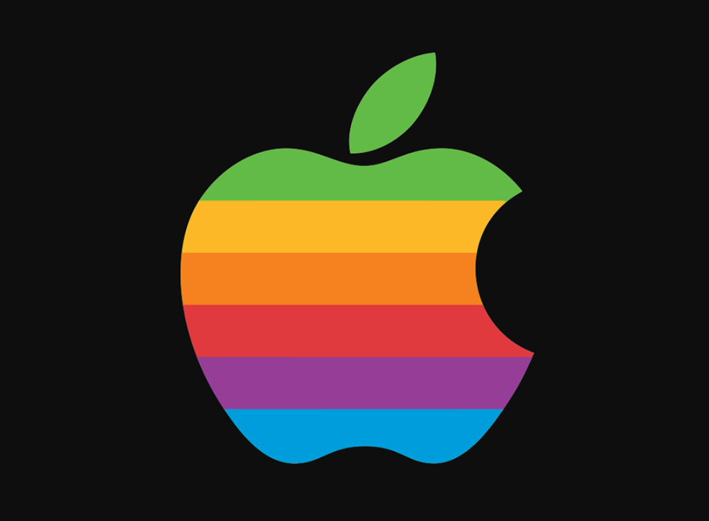
Image courtesy: https://bit.ly/33PQILP
If you check out the stickers from Apple, you will see that the company has retained its brand value even when it has used multiple colors. How? The company has kept the design as simple as possible and that is what it is known for. It has not experimented with any other shape than its own logo, which is also a reason that you can recognize the brand.
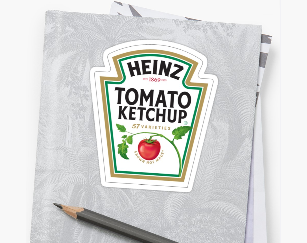
Image courtesy: https://rdbl.co/2RoZgXv
Now, if you are not the owner of Apple, you have to take a different approach. Take a look at Heinz Ketchup sticker and you will understand that it’s not really difficult to capture the essence of your brand.
Call-to-action:
Call-to-action or CTA button is a part of your marketing efforts. Your website or social media pages or brochure or any other marketing asset must include a CTA button. So, the same theory applies when it comes to stickers as well. However, I have seen that many companies either don’t use CAT buttons or the CTA buttons that they use are not appropriate.
What is call-to-action? It is either a clickable image or a text that will ask the viewers to click take an action such as contact you or order your service etc. However, the CTA buttons that you can use on your websites are not applicable when it comes to stickers. It should be more understated

Image courtesy: https://bit.ly/2rZyn1T
When I say call-to-action, I don’t mean that you should use a sentence like “call us now” or “click here to contact us”. On the contrary, your call-to-action should be subtle. Your audience should not feel like they are being forced into taking action. Rather, the decision should be theirs to take.
So, what can you do?
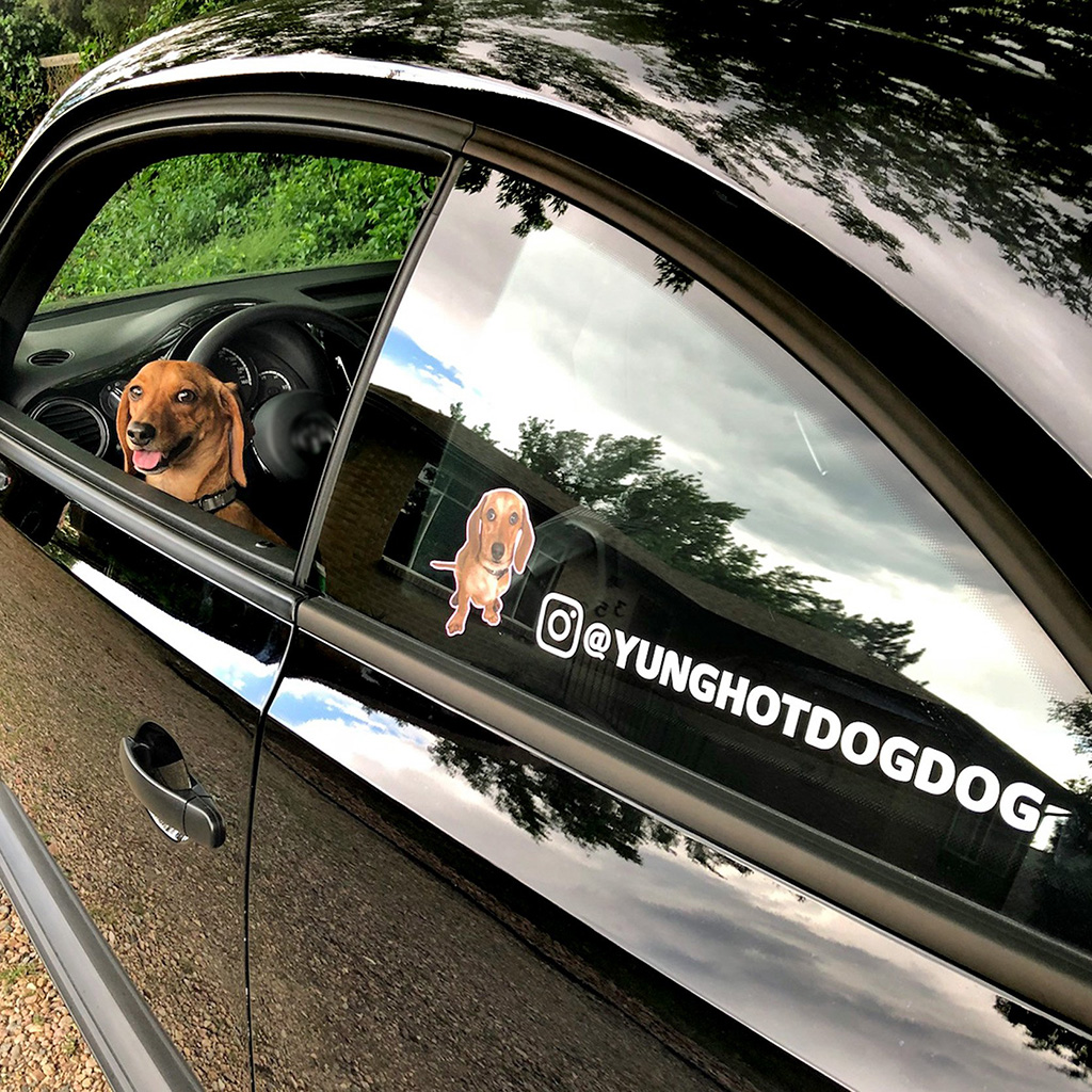
Image courtesy: https://bit.ly/2sS5BRd
The first thing that you can do is you can include a barcode a barcode is the simplest way to capture the attention and driving people to take action, which is to scan the barcode. You can also create a sticker using a social media icon and add your social media handle as a CTA button. Keep experimenting with the CTA buttons. You can also hire professional designing company to help you out with innovative CTA buttons.
Choose CMYK instead of RGB:
While digital designs look good on RGB color scheme, print designs look good when used CMYK color scheme. Now, if you hire a professional graphic design company that has past experience in creating printable design, you don’t have to worry about the color selection. However, it is still important for you to understand why it is necessary for you to use CMYK instead of RGB.
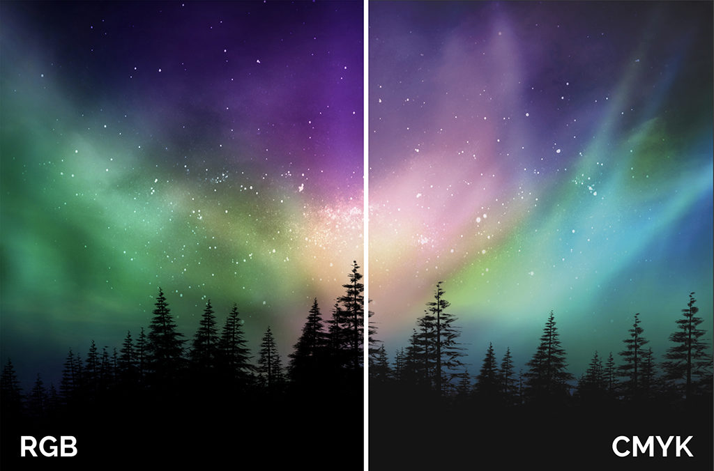
Image courtesy: https://bit.ly/366s3nP
RGB stands for Red, Green and Blue. CMYK stands for Cyan, Magenta, Yellow and Black. So, why should you use CMYK for your sticker design? The reason is that when you will print the design, the paper will absorb light. On the contrary to this, computer or mobile or any digital screen reflects light. So, when you print anything on paper, RGB color scheme can’t give you the best image that you expect. You get a better and more vibrant outcome from using CMYK color scheme for your stickers.
Vector design for best results:
As I have already mentioned, you can create stickers that are huge in size as well as the ones that are to be stuck behind your mobile phones. So, if the resolution of the image is not good, can you imagine the disaster that will take place? When you will print the sticker, it will look bad.
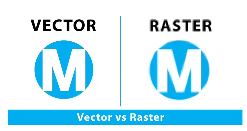
Image courtesy: https://bit.ly/2LHOKHt
The best way to design your stickers is to create the design in vector. No matter how big or small your design is, you won’t have to worry about the image getting pixelated, in digital format or in printed version. Hence, the sticker can be printed for wall printing, t-shirt printing, coffee mug printing, laptop cover printing etc.
Keep the design simple:
If you take a look at the famous designs, you will notice that most of these are simple design. You may have already understood by the suggestion of using simple typography and writing less that the design shouldn’t look overcrowded. It’s petty to go overboard with a design when you have a lot going in your mind.

But you have to remember that your sticker is not where you can share the story of how your company started nor is it the right place to share the testimonials of your clients. You can take reference from other designs (obviously, don’t copy) and create a simple design that has originality.
How to print the stickers?
Whether you have completed the sticker design by yourself or you’ve hired a graphic design agency, your sticker design should be ready by now. Make sure that you complete all the changes and update the design so that it is ready to be printed by now. Follow the next steps to complete the process of printing. Even though you may think this step to be the most difficult, we will get it done together.
Choose the print material:
There are a few options when it comes to choosing materials where you can print your sticker design. However, most of the stickers are generally printed on vinyl, be it small or big. In some cases, the sticker can be printed on t-shirt material.
Now, for the vinyl stickers, you have to decide whether you want the sticker to be matte or glossy. While the glossy stickers will look shiny, the matte ones will be less shiny.
Image courtesy: https://bit.ly/2DSOgcV
You can either choose a colored vinyl for your plain stickers or you can choose a clear background for the customized stickers. The clear background shows the customized design without incurring the cost of cutting the stickers as per their shapes. You can also use clear vinyl so that the stickers can be used on transparent surface.
Set the size and resolution of the printing:
To get your sticker printed nicely, you have to set the resolution first. Even though you have designed the sticker in vector, while printing, you have to choose a particular size and resolution. You can choose inches or centimeters or pixels to determine the size of the sticker. 300DPI should be your ideal image resolution.
You also need to pay attention to designing the edges of the font so that it looks prominent when printed. You can either use Photoshop or Adobe Illustrator to flatten the edge of the fonts or you can hire a graphic design company that can help you with the design works.
Trim the border:
The last thing that is needed for your sticker design is trimming the borders of your sticker. You have to allow some area to bleed (3 to 4cms) and then trim. The bleed area allows you to trim the edges properly without ruining the sticker. The reason behind this step is to make sure that the design fits inside the given space and no part of the design or the text is cut off.
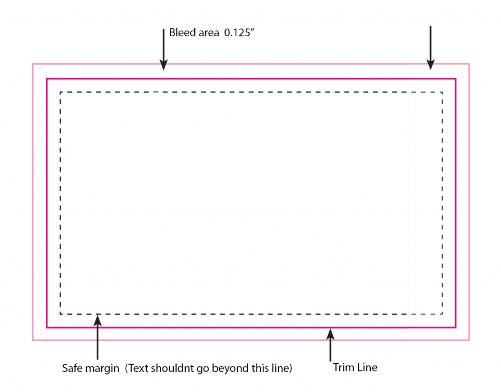
Image courtesy: https://bit.ly/2sJ3dvQ
Conclusion:
If you are new into designing and printing stickers, the process may seem intimidating to you. However, let me assure you that it is not that tough. However, expertise in this field will always play in your favor. If you have knowledge on creating designs or handling designing software, everything becomes much easier.
But you don’t have to worry if you don’t have acquaintance in designing. Nico Digital is here to help you out with the process. By hiring the company you can hire the professional designers working under the same roof for years. You can choose any pricing plan depending on your needs and rest assured that you will be delivered your task within the promised time.